Thursday, 30 September 2010
Wednesday, 29 September 2010
Final Script
The Girl Next Door
Written by Rahil Qureshi, Tatiana Serna and Ali Hussein
October 15th, 2010
EXT. High Street Kensington -- club
M.S of Ali talking to Rahil in the center of the club, Rahil's facial expressions show that he is excited about were he is.
Ali
What is this?
Rahil
This is what I call a real girl club
Ali
You’re a disgrace
Rahil
Watch and learn
(Goes of and starts dancing with boys)
L.S of Ali turning baker around, Both of there facial expressions showing how much shock there in seeing each other.
Ali
Oh my day’s, what you doing here?
Baker
Oh my day’s Ali, what’s going on?
Ali
Nothing man, just with my brother
Baker
What he’s gay
Ali
Yh man, what you doing here?
Baker
Ah, nothing man just checking it out init.
Ali
Oh, I’m getting irritated in here come we go
Baker
Yh man, Hurry up this place is shit!!!
(Ali turns to Rahil)
Ali
Rahil let’s go
Rahil
But I’m having fun
Ali
NOW
Rahil
Ahhh, one minute
(Hugs boy he was dancing with, and then they leave)
EXT. Wall Grave Road -- Ali, Baker and Rahil walking on the street.
L.S of Ali, Rahil, and Baker walking down Wall Grave Road, a cold winter's night. As boys walk down the road the camera zooms out.
Ali
That place was shit
Baker
Yh man
Rahil
What you guys talking about it was the best
Ali
Baker where you going are house is her
Baker
What is your mum in?
Ali
Nah man we got a free yard, mum and dad gone away for the weekend
Baker
Oh
C.U of Rahil passing the keys to Ali
M.O.A of the door closing.
M.S of boys walking up the stairs and into Ali's room
Ali
Rahil go upstairs I want to spend some time with my friend
M.S of Rahil
Oh, I want to stay with you guys
M.S of Ali
Go out, I’m not going to repeat myself
M.S of Baker
Take care bro
(Baker reaches out to shake Rahil’s hand, close of hand)
M.S of Rahil
Bye, love
M.S of Ali
Oh, just go upstairs
L.S of Ali turing to Baker and taking his jacket off
Ali
Baker make yourself comfortable
Baker
Is that a shisha pipe let me start it up
Ali
Yh, do your thing
M.S of Baker starting up the Shisha Pipe
L.S of Ali turing to Baker
Ali
Listen I’m gonna start my work out
Baker
Yh do your thing
C.U of Ali taking off his top
L.S of Ali starting his work out
C.U of Baker showing his facial expressions
L.S of Baker walking towards Ali and purposely falling over
L.S of Ali getting angry
Ali
What the hell you doing?
Baker
Ah, nothing man, just dropped my jacket
Ali
bloody hell man, I’m starting to think twice about your sexuality
Baker
Ah shit, look at that chick
M.S of Ali rushing over to the window)
M.S of Ali showing off his body to Baker
Ali
Ohhh, she’s sexy
L.S of Tatiana walking towards the house
M.S of Ali panicking and getting stressed out
Ali
Shit she’s coming here
Baker
Relax man, she ain’t all that
Ali
How do I look?
(Poses and tenses body)
Baker
Why you asking me thought you thought I was gay and that
C.U of Tatiana ringing door bell
M.S of Ali
Ali
Watch me move to her
Baker
Let me come with you
Ali
Nah man stay her
L.S of Ali walking out of the room, slowly baker follows
M.S of Ali opening the door
O.T.S of Tatiana
Ali
Hi
O.T.S of Ali
Tatiana
Hi, I’m Tatiana I just wanted to welcome you to the neighbourhood
O.T.S of Tatiana
Ali
Thanks, how you been?
O.T.S of Ali
Tatiana
Fine thanks
O.T.S of Tatiana
Ali
You know I used to have a dog that I really loved your hair reminds me of him
O.T.S of Tatiana
Tatiana
Oh, well I’m gona be off now take care
O.T.S of Tatiana
Ali
Oh, do you wanna come in?
O.T.S of Ali
Tatiana
No thanks
O.T.S of Tatiana
Ali
O.k. then take care, bye
C.U of Ali and Tatiana Shaking each others hands
O.T.S of Ali
Tatiana
Bye
M.S of Ali turning around, as he turns we see Baker standing there
M.S of Ali about to get angry as we see his body language and facial expressions change
Ali
What the hell you doin her?
Baker
I’m just looking for my jacket
Ali
You and your jacket, let’s go upstairs
L.S of Boy’s walking upstairs into the room
Cut to black.
The End
Tuesday, 28 September 2010
Draft of Script
The Girl Next Door
Written by Rahil Qureshi, Tatiana Serna and Ali Hussein
October 15th, 2010
EXT. Tatiana’s house – Wall Grave Road – Evening
M.S of brothers having a conversation on the bed, lying down
Ali
Ali
That club was live, just lacking a bit of girls!!!
Rahil
I didn’t like it
Ali
What do you mean you didn’t like it? What wasn’t there to like
Rahil
All the girls, you know how I am
Ali
What do you mean how you are?
Rahil
Girls ain’t my thing, guys are
Ali
DON’T TALK LIKE THAT YOU KNOW I’M TRYING TO CHANGE YOU, FIX UP
(Slaps Rahil around the head)
Rahil
Ouch Ali, why you so violent?
Ali
yh, that’s because you know I’m trying to change you, don’t talk like that in front of me
Rahil
Good Ali whatever
Ali
I want you to like Girls not guys
Rahil
Well, you know how I am
Ali
That’s why I took you to a straight club
Rahil
And I didn’t like it, Let me take you to a real club, I’ve seen your world so let me show you mine
Ali
Fine
EXT. High Street Kensington -- club
M.S of Ali talking to rahil in the center of the club, Rahil's facial expressions show that he is excited about were he is.
Ali
Ali
What is this?
Rahil
This is what I call a real girl club
Ali
You’re a disgrace
Rahil
Watch and learn
(Goes of and starts dancing with boys)
L.S of Ali turning baker around, Both of there facial expressions showing how much shock there in seeing each other.
Ali
Ali
Oh my day’s, what you doing here?
Baker
Oh my day’s Ali, what’s going on?
Ali
Nothing man, just with my brother
Baker
What he’s gay
Ali
Yh man, what you doing here?
Baker
Ah, nothing man just checking it out init.
Ali
Oh, I’m getting irritated in here come we go
Baker
Yh man, Hurry up this place is shit!!!
(Ali turns to Rahil)
Ali
Rahil let’s go
Rahil
But I’m having fun
Ali
NOW
Rahil
Ahhh, one minute
(Hugs boy he was dancing with, and then they leave)
EXT. Wall Grave Road -- Ali, Baker and Rahil walking on the street.
L.S of Ali, Rahil, and Baker walking down Wall Grave Road, a cold winter's night. As boys walk down the road the camera zooms out.
Ali
Ali
That place was shit
Baker
Yh man
Rahil
What you guys talking about it was the best
Ali
Baker where you going are house is her
Baker
What is your mum in?
Ali
Nah man we got a free yard, mum and dad gone away for the weekend
Baker
Oh
C.U of Rahil passing the keys to Ali
M.O.A of the door closing.
M.S of boys walking up the stairs and into Ali's room
M.O.A of the door closing.
M.S of boys walking up the stairs and into Ali's room
Ali
Rahil take you slippers upstairs to your room
C.U of Rahil picking up his slippers
M.S of Rahil walking upstairs
M.S of Rahil walking upstairs
L.S of Ali turing to Baker and taking his jacket off
Ali
Ali
Baker make yourself comfortable
Baker
Is that a shisha pipe let me start it up
Ali
Yh, do your thing
M.S of Baker starting up the Shisha Pipe
L.S of Ali turing to Baker
Ali
Ali
Listen I’m gonna start my work out
Baker
Yh do your thing
C.U of Ali taking off his top
L.S of Ali starting his work out
C.U of Baker showing his facial expressions
L.S of Baker walking towards Ali and purposely falling over
L.S of Ali getting angry
L.S of Baker walking towards Ali and purposely falling over
L.S of Ali getting angry
Ali
What the hell you doing?
Baker
Ah, nothing man, just dropped my jacket
Ali
bloody hell man, I’m starting to think twice about your sexuality
Baker
Ah shit, look at that chick
M.S of Ali rushing over to the window)
M.S of Ali showing off his body to Baker
Ali
Ali
Ohhh, she sexy
L.S of Tatiana walking towards the house
M.S of Ali panicing and getting stressed out
Ali
Ali
Shit she’s coming here
Baker
Relax man, she ain’t all that
Ali
How do I look?
(Poses and tenses body)
Baker
Why you asking me thought you thought I was gay and that
C.U of Tatiana ringing door bell
M.S of Ali
Ali
Ali
Watch me move to her
Baker
Let me come with you
Ali
Nah man stay her
L.S of Ali walking out of the room, slowly baker follows
M.S of Ali opening the door
M.S of Ali opening the door
O.T.S of Tatiana
Ali
Ali
Hi
O.T.S of Ali
Tatiana
Tatiana
Hi, I’m Tatiana I just wanted to welcome you to the neighbourhood
O.T.S of Tatiana
Ali
Ali
Thanks, how you been?
O.T.S of Ali
O.T.S of Ali
Tatiana
Fine thanks
O.T.S of Tatiana
Ali
Ali
You know I used to have a dog that I really loved your hair reminds me of him
O.T.S of Tatiana
Tatiana
Oh, well I’m gona be off now take care
O.T.S of Tatiana
Ali
Ali
Oh, do you wanna come in?
O.T.S of Ali
Tatiana
Tatiana
No thanks
O.T.S of Tatiana
Ali
Ali
O.k. then take care, bye
C.U of Ali and Tatiana Shaking each others hands
O.T.S of Ali
Tatiana
Tatiana
Bye
M.S of Ali turning around, as he turns we see Baker standing there
M.S of Ali about to get angry as we see his body language and facial expressions change
Ali
Ali
What the hell you doin her?
Baker
I’m just looking for my jacket
Ali
You and your jacket, let’s go upstairs
L.S of Boy’s walking upstairs into the room
M.S of Baker smoking Shisha, while Ali is laying down on the bed with his shirt unbuttoned
Baker
Baker
So what she say?
Ali
She was on me, she wanted to come in but I said no because you’re her, see friends come first
M.S of Rahil opening door and walking in
C.U of Baker's face showing his facial expressions
Hand held camera on Rahil as Baker eyes him up and down
Rahil
C.U of Baker's face showing his facial expressions
Hand held camera on Rahil as Baker eyes him up and down
Rahil
HEYYYYYY boys, That girl was cute
Ali
I know she likes me
Rahil
Huh, you please
Ali
She does
Rahil
Whatever, guys put some music on your so boring
M.S of Ali turning on music, Shaggy it wasn’t me starts playing
C.U of Ali and Baker turing to each other and saying
It wasn’t me
M.S of All the boys dancing
(Lights turn of, and music stops playing)
Rahil and Baker
Ahhhhhhhhhhhhhh
(Lights turn back on)
L.S of Rahil in Baker's arms, and Ali looking in disppear
Rahil
L.S of Rahil in Baker's arms, and Ali looking in disppear
Rahil
What the hell just happend
Ali
I dunno just stay up her and let me check it out
C.U of Rahil, shaking and panicing
Rahil
Rahil
Ali please don't go, I’m so scared, just be careful
M.S of Ali
Ali
Ali
Don’t worry
M.S of Ali going downstairs
C.U of Rahil and Baker hugging
M.S of Ali rushing up the stairs, holding a piece of paper)
M.S of Baker
Baker
Baker
Get off your brothers coming
M.S of Ali
Ali
Ali
Look what I found
M.S of Rahil
Rahil
Rahil
Oh my day’s
B.E.V of Boy’s reading the piece of paper
Altogether
YOU HURT ME, SO BE CAREFUL
M.S of Rahil
Rahil
Rahil
Oh My god
M.S of Ali
Ali
Ali
Just calm down, lets just get out of her
M.S of Rahil
Rahil
Rahil
Yh lets go
L.S of Boys leaving the room, while they walk out of the room Ali chucks the paper onto the floor
C.U of Ali switchiing the light off
C.U of Ali switchiing the light off
C.U in night vision of the paper, out of nowere a hand appears and picks up the paper
Cut to black.
The End
Monday, 27 September 2010
Brand Identity
WHO ARE WE?
The name of our brand is Silverlight and it is a short film production company who produce comedy and thriller films, which are edited for continuity and create meaning. Our company have a clear target, which is to entertain our audience and let them see humour even while watching a film which has a serious storyline.
WHAT WE WANT TO ACHIEVE...
We intend to meet our audience’s needs and expectations by showing them films that contrast to our genre and furthermore make them feel emotionally involved in the film, and cause suspense keeping them thinking about what will happen next in the story. We all have a quirky, funny personality and enjoy a good laugh, therefore we wanted to express these personalities through out our productions as our production mostly produces comedy films therefore these personalities are match with the genre of the films the production produces.
HOW WE PLAN TO ACHIEVE THIS...
We plan to satisfy all our customers that is why we have carried out a questionnaire and will carry on doing so constantly to make sure we fulfil the audience's needs and expectations.
Throughout the production the Font and style of writing will be the same as we want the audience to identify the production by looking at the smallest details such as fonts, logos or even slogans. The font will be simple and eye catching so that the audience will have a better chance of identifying the production just by looking at the font.
We plan to achieve this by setting ourselves objectives and aiming to the targets we set.
Posted By SilverLight Productions
We decided to base most of our filming in a house as the storyline we produced will match the location perfectly because the main and most important scenes will happen in the house due to the fact as the story evolves when one of the characters has a free house as his parents have gone on a vacation. Another location we picked is High Street Kensington as it is very famous area with a good nightlife and as the characters will be going out during the night High Street Kensington is the perfect match as it also has nightclubs and the story will seem more realistic.

Sunday, 26 September 2010
Initial Idea
When we decided to do a short film, we thought of a comedy.We looked at some codemy films and got inspired by The Hungover.
IDEA:
A group of six friends take a weekend off out of the city to celebrate their friend's stag night. The night they arrive they get very drunk, call up strippers and have a wild night they will never forget. The next morning they guys wake up only to find out that the groom-to-be was missing and none of them remembers what happened the previous night. In desperation they decided to separate into two search parties so they can find the groom quicker, as they only have less 24 hours to find him and get back to the city in time for the wedding...
PROBLEMS WITH THIS IDEA:
The main reason we decided to change ideas was because it would have been very difficult for us to go out of the city to film this and also we would have needed contact with the Police which would have been impossible.
Posted By SilverLight Productions
Saturday, 25 September 2010
Magazine review of Machete
The focus point of the review is the picture as there is a close up mid shot of the character. The image is more important than the title as the character is popular and known by the viewers. By looking at the image the viewer can tell that there is going to be violence involved in the film. His facial expressions show the viewer that he is really angry and has a lot of aggression inside him. This shows the audience what type of character he is in the film. By him grinding his teeth together it interprets that he is furious with someone and he wants to take his frustration out on them.
By looking at the characters costume we can tell that he is a rebellious person. He is dressed as an American biker who goes around looking for trouble. He also has tattoos on his arm, which suggest that he is a rough and fearless person. He also has a chain with animal teeth, which in South America might suggest he belongs to some kind of tribe. He is wearing a lot of leather, which suggests class and money, however in this case there is a contrast, as it seems as if he has no class; as he looks more like a thug. He is riding a cruiser motorcycle which has a machine gun attached to it, this implies that he is someone who has attitude and not afraid of anyone. It looks like he is on a mission to kill someone.
The layout of the review is done clearly and presented well. The focus point of the review is the image. The image is in the centre of the review, which immediately catches the viewer’s eye. Around the image there is writing about the film which tell the viewer whether or not the film is good or not. There are also some verdicts from newspapers that have rated the film and made a comment about it.
The font used for the title is serious and plain which reflects the character and the genre of the film. The review focuses more on the image than the title. The title is in a different colour to the text on the article as it makes it stand out more.
The title is written in petrol blue with big capital letters. The text on the article has more of a serious look to it, which reflects the film.
There are a couple of comments by newspapers on how good the film is. This helps advertise the film and promote it, as the comments will encourage the audience to go and watch the film. This is a clever way of advertising the film, as it is cheaper and a good technique in engaging the audience’s attention in going to see it.
Monster magazine article analysis
The “Monster” magazine article review displays 1 large image on the first page which catches the readers attention immediately as it takes the space of most of the first page, the second page has two images one over another and they both link to each other as there is a caption which explains both images and gives audiences an idea of what the film is about looking at the two images.
In the background there is information on how the film was made and what influenced them.
The first image looks like there is a male in his 30’s with a camera standing in a weird looking setting, looks like a scrap yard. This gives audiences something to think about as it will allow them to wonder about why the male is holding a camera and what does he want to take pictures of. The second and third images are linked together and the one on top looks like some sort of spaceship, which gives audiences an idea why the film is named monsters as space ships are common with monsters. The second image looks like an arm over a weird looking animal/monster this represents the title of the film as its called monsters. This gives audience the feeling that the film will have many different unusual creatures and the film will feel like a sci-fi action film. All the images bring catch the attention of the audience as the images are large and give them an idea of what the film will be about.
All the text used has a formal font style and with colour of the font being plain black this shows that the film is serious and is not a humorous film, this also gives the audience a feeling that film will be about a serious matter and will have humorless storyline.
The title is written in a bluish/greenish colour, this shows that it may be about weird creatures as there are many stereotypes which suggest monsters are green or blue. Furthermore the font of the title is quite formal, this suggests that the film is about a serious matter and the story has a bold outline and setting.
There are a couple of comments to suggest how good the film is from other newspapers and well known people. This is a technique used to help the film get more sales and promote it, as more people will go to watch it due to the good critism from the well known people also it helps improve the films level of popularity because the more people say its good, the more people will watch it, in other words this technique is called word of mouth.
Overall the article explains briefly the outline of the story for those who are considering to watch it, and as we move in the article you will learn more in depth information and the story will be more clear to the audience who will want to watch it.
The review is really conventional throughout the magazine article as the brand identity is pretty obvious due to the colour schemes used, the font used and the layout of the article.
Paranormal activity 2 magazine article review
The paranormal activity 2 magazine article is quite short as it is placed on half a page. There is only one main image which quickly catches the reader’s attention, the background of the page is white and plain. The main image is a dark room with a baby standing up on his bed looking scared, there is also a caption which states "you've been framed had gone right downhill.” This gives audiences an impression that the film has a serious feeling about it, and the film is far from humorous due to the image and the caption.
There is information about the film, the day it was released, the certificate, director, cast, running time and etc, these sometimes help engage more audience and attract them to come watch it as some audiences tend to like watching films based on the director or the cast. Furthermore there is a short plot on what happens in the film, this is a technique used to give audiences an idea about what the film is about and what the genre of the film is.
The main text is a review about the film stating the good and bad parts of the film, if its worth watching and what the verdict of the film is.
The main image they used for the magazine article was a good one as it portrays the title of the film "paranormal activity" due to the setting being dark and mysterious, also showing a baby standing up on his bed watching a side of the room to make it seem as there is something weird and unusual about the room. This gives audiences an impression that the film has something to do with horror or thriller and that the film will be based around the room or even the house.
All the text used has a formal font and the colour of the text is black and plain this gives audiences a feeling that the film has a serious genre about it, as looking at the font it looks like its a horror film, moreover the font is basic, straightforward and not at all exciting which makes it seem like the film has no humour its about a serious matter. The text colour being black also represents evil, darkness and something mysterious about the film this also portrays the name of the film “paranormal activity”.
Overall the article explains briefly the outline of the story for those who are considering to watch it, and as we move in the article you will learn more in depth information and the story will be more clear to the audience who will want to watch it.
The review is really conventional throughout the magazine article as the brand identity is pretty obvious due to the colour schemes used, the font used and the layout of the article.
Road Magazine Review Analysis

All three images used in the article show the audience how much in need the father and son are of money, as the pictures show the viewer that they are struggling and give an idea of the kind of film it is going to be. The picture on the top left show the father’s facial expressions and makes the audience feel sympathy towards him. The picture on the top right shows the father holding onto the son as if to say that he has no more strength to carry on and that they only have each other.
The font used for the title is simple, clear and straight forward. The article is more focused on the characters than the title, as seen through the range of pictures used. This is because the characters used in the film are well-known and famous.
The title is written in white with big capital letters. The text on the article is in simple font which is clear to read and understand.
There are a couple of comments by newspapers on how good the film is. This helps advertise the film and promote it as the comments will encourage the audience to go and watch the film. This is a clever way of advertising as it is cheaper and a good technique in engaging the audience’s attention in going to see it. The article also tells the audience how well rated the movie is which is an important point for the viewer.
The article gives the audience a load of information and the layout of the article makes that information comes out clearly. The pictures are shown as the biggest thing in the article as they have chosen that to be the focus point. The director has the pictures to be the main focus point as he/she feels that is what will engage the audience to come and watch the film. There are paragraphs of what the film is about and what impact the director wanted there to be when people go and watch the film underneath the pictures. There are five paragraphs laid out one-by-one underneath the pictures which make the article quite descriptive.
At the bottom of the article there are three lines in bold blue which say “The road is a harrowing tale about the fragility of humanity but one that offers a note of hope to”. This gives the viewer a hint of what the film is going to be about. This is done to make the viewer want to go and see the film, and want to know what is going to happen. As the sentence makes the viewer gain an interest in what hope there is to offer.
Posted By SilverLight Productions
Posted By SilverLight Productions
Friday, 24 September 2010
The Ugly Truth
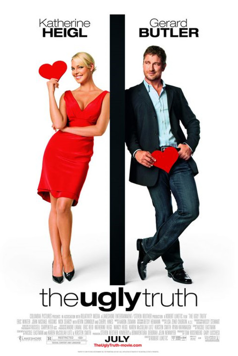
The two characters in the poster have the same posture and facial expression, only they are looking different ways and are separated by a big, dark barrier which suggests rivalry. Their names at the top are also separated by the same barrier. The use of red symbolises love, passion and lust. This all imply that this is comedy romance.
However, the characters do have something in common, the heart they are both holing. The female character is holding her heart close to her brain whilst the male character is holding his close to his penis; this might be due to the saying that:“women think with their brain and men think with their penis”, again emphasising the opposition between the two. They are both dressed very elegantly which suggests upper class but also, they are dressed as though they are going on a date which contrasts the genre of the film. The female character is wearing red and the male character is wearing blue, this is a representation of Femininity and Masculinity.
The title is below the actors and right in the middle. The word ‘ugly’ is in bold; this might be due to the revolting foe that will be unleashed between these two. The fact that the background is white makes the red stand out and therefore the attention is mostly drawn to her, as she is wearing all red. The billing block is written in white and as the background is also white then it is merely visible. At the very bottom, in the middle is the release date in black, bold capital letters.
Taken
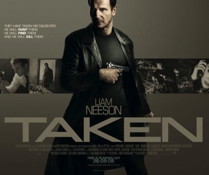
He is wearing all black which again suggests mystery and camouflage, as if he is trying to make himself unnoticeable. The gun in his hand and long, black leather coat he is wearing imply he might be some kind of detective; which indicates violence and action. The shot they have chosen for the main character makes him look tall, powerful and dangerous which emphasises on his role and genre of the film.
The background has some of the scenes in the film to interest and intrigue the audience.
The title is written in white, bold, big capital letters as is the actor’s name just above it, so that it is more visible and to stand out from the neutral background.
There is a tagline at the bottom of the poster just above the release date written in small letters “time is running out”, which has a double entendre, it could have something to do with the film or because it is written right above the release date, it could suggest that time is running out for the public to go and see the film.
There is a long tagline at the top left hand side: “THEY HAVE TAKEN HIS DAUGHTER. HE WILL HUNT THEM. HE WILL FIND THEM. AND HE WILL KILL THEM”. This tagline is very interesting and catchy. The words hunt, find and kill are in bold which gives the audience a clue on the insight of the film.
This poster has been promoted very well; it gives the audience a focus on the genre and a deep understanding on the role of the character.
Subscribe to:
Comments (Atom)