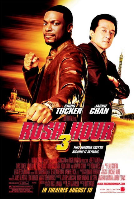
The poster follows clear conventions such as the title, characters, and actor’s name. All these conventions inform the audience about who is going to be in the film, and this is significant in attracting more viewers. The actors are more important than the title. This is because the actors are really famous and known. Jackie Chan is a very famous actor and Chris Tucker is known as a very funny comedian. The title is not that important as there has been two previous rush hours before and that is the reason why the actors are shown more powerful.
In the background we see the Eiffel Tower which tells the audience where the film is set. At the bottom of the poster there is the release date of the film. This is important information to the viewer as they are told when they can watch the film.
The colours used in the poster are red, yellow, brown and white. Three of the colours used are really attractive, and this engages the viewer’s attention. The titles size is quite big and the colour used for the title is red. This suggests passion, blood and danger.
No comments:
Post a Comment